CLICK HERE TO DOWNLOAD ACTIVITY 4
CLICK HERE TO DOWNLOAD THE ACTIVITY 4 EXCEL WORKBOOK
Purpose
- Teams will understand how artificial intelligence is used in smart grids.
- Teams will “train” the AI for the smart grid by adjusting the power distribution for 10 selected users throughout different parts of the day during a partial outage.
- Teams will evaluate how power is redistributed in a natural disaster based on available resources and determined priority.
- Teams will create their own distribution plans for a simulated outage and justify their plan.
- Teams should use this activity to understand how they want their smart power grid design to work efficiently during a natural disaster.
SETTING THE SCENE – Power Plant AI Engineering Team
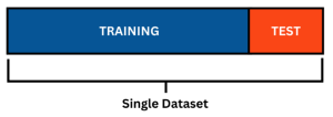
Your team has been hired by your local power plant as AI Engineers! Luckily, most of the data you need, you have already gathered and visualized in the previous activities. Now, the power plant company has tasked you with using that data to train an AI to be able to handle power distribution during partial outages caused by natural disasters. In this activity you be setting up your simulated power grid using the user types you have selected and generated power consumption data for, then you will be creating a dataset for the AI to train on (how it “learns”) and evaluate its performance (these are known as the “training set” and the “test set”).
The dataset should consist of distributions that result in the ideal scenario that you want your model to achieve, therefore you will be using the user types and user priorities that you have determined in previous activities to manually adjust the distribution of power over a daily period during a partial outage. It will be up to your team to provide reasoning for your decisions and reallocate power in a way that is resourceful.
The overall goal is for this AI model to eventually be able to predict the energy consumption of these users at any given time of the day and automatically adjust the power distribution to minimize users on the grid without enough power (in order of priority).
What is “Artificial Intelligence”?
“It is the science and engineering of making intelligent machines, especially intelligent computer programs. It is related to the similar task of using computers to understand human intelligence, but AI does not have to confine itself to methods that are biologically observable.” John McCarthy, 2004
Simply put, AI is the ability of a computer to do tasks that humans could also do. However, AI can also be seen as a field, which combines computer science and powerful datasets, to enable problem-solving. Artificial Intelligence has become very popular in recent years and is being implemented all around us. However, there is currently a massive effort to utilize AI to solve more complex problems.
First, let’s look at some examples of AI that you might come into contact within your everyday life: [1]
- Personal Assistants: AI-powered personal assistants, such as Siri, Google Assistant and Amazon Alexa, are integrated into smartphones, smart speakers and other devices and can perform a wide range of tasks, from setting reminders and sending messages to playing music and controlling smart home devices.
- Social media: Social media apps, such as TikTok, Instagram, and Snapchat, utilize AI to examine user preferences and behavior, suggest pertinent materials, and customize the user experience, Moreover, AI systems can eliminate harmful content such as hate speech.
- Customer service: Businesses are increasingly using virtual assistants and chatbots powered by AI to offer 24/7 customer service. Natural language processing is used by these chatbots to comprehend consumer questions and deliver relevant responses.
- Autonomous vehicles: AI is used in self-driving cars, trucks, and buses to perceive their environment, map out routes and make judgements while driving. This technology can lessen collisions, gridlock in the streets, and pollutants. For instance, Tesla uses AI to power its self-driving cars, which can navigate roads, highways, and parking lots without human intervention.
Now, let’s look at some of the more complex AI initiatives which will transform the world around us:
- Healthcare: Physicians are already using AI as a tool to help them read and interpret tests.AI algorithms can analyze vast amounts of data, identify patterns, and make predictions. In the future, AI may analyze and diagnose a person based on medical tests and records, body imaging, pathology, test, and other lab tests. [2]
- Education: There are many apps, such as Duolingo, which combine human expertise and AI to provide educational content. In the future, AI models could be used in school to track the progress of each individual student and generate teaching methods/content tailored to them. [3]
- Power & Electricity: Continue reading below to learn about the ways in which smart power grids leverage AI algorithms and analytics to optimize distribution, improve reliability, and enable more effective energy management.
Instructions
Training Your Smart Grid to Distribute Power in a Partial Outage
STEP 1 – Transfer your Data
Now that you have your simulated grid power consumption for a day from the previous activity in the “act4_power.xlsx” file (generated from the pre-work section), you can open the excel workbook given to you for this activity titled “PTCHS_24_Activitiy 4.xlsx” and start to train your smart grid.
This file contains the energy consumption data transformed into power consumption data for each user type. In activity 3, the data was presented as energy consumed every 15 minutes by the specific user type in units of kWh (kilowatt-hours). In activity 4, the “act4_power.xlxs” spreadsheet has already converted energy (kWh) to power (kW) for you as well as multiplied power consumption for the numbers of each user type.
- Open “xlsx” and “PTCHS_24_Activitiy 4.xlsx” excel workbook files.
- In “PTCHS_24_Activitiy 4.xlsx” navigate to the fourth sheet in the excel workbook titled “”
- This “Raw_Power_Data” is where you will replace the placeholder data with your own data that you generated in “xlsx.”
- Now we are going to transfer the data from “xlsx” to “PTCHS_24_Activitiy 4.xlsx.”
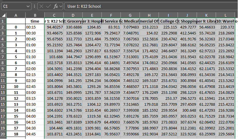
- In “xlsx” – select cells C1: L1 by clicking C1, hold shift and clicking L1 while still holding shift.
- KEEP holding shift and scroll down to cell L97 and select it. This should select all your data from users 1-10. Figure 1
- Copy the data using ctrl + C or right click and select copy
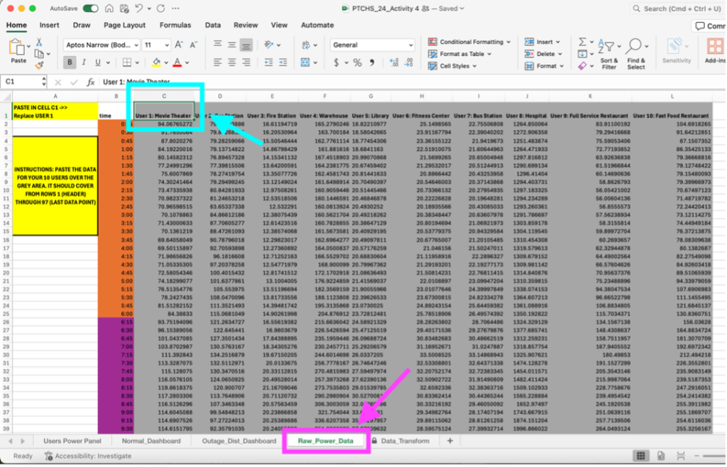
- Move to the “PTCHS_24_Activitiy 4.xlsx” excel workbook and select C1 (User 1’s name in the placeholder data) and PASTE (ctrl+v or right click ,paste) the data from “xlsx”.
- It should replace all of the placeholder data from C1 to L97 Figure 2
Figure 1: where to pull the data from in the “act4_power.xlsx” file. Figure 2: where to paste the data in the “PTCHS_24_Activitiy 4.xlsx” file. Please paste the data for all 96, fifteen-minute intervals, use the time column to guide you.
- Important: If you chose to change one of these user types to something you prioritized in earlier activities and want to relabel one of the users (for instance changing “Movie Theater” to “Water Utilities”) you would do that now.
- Change the name next to User #: ABC in row 1 (for instance C1 for User 1), to the new user and it will change throughout the excel workbook.
STEP 2 – Getting to know the Dashboard
Before we reallocate power and create the dataset for our AI model, let’s go over the different sheets and what they are used for and what they can tell you about the data.
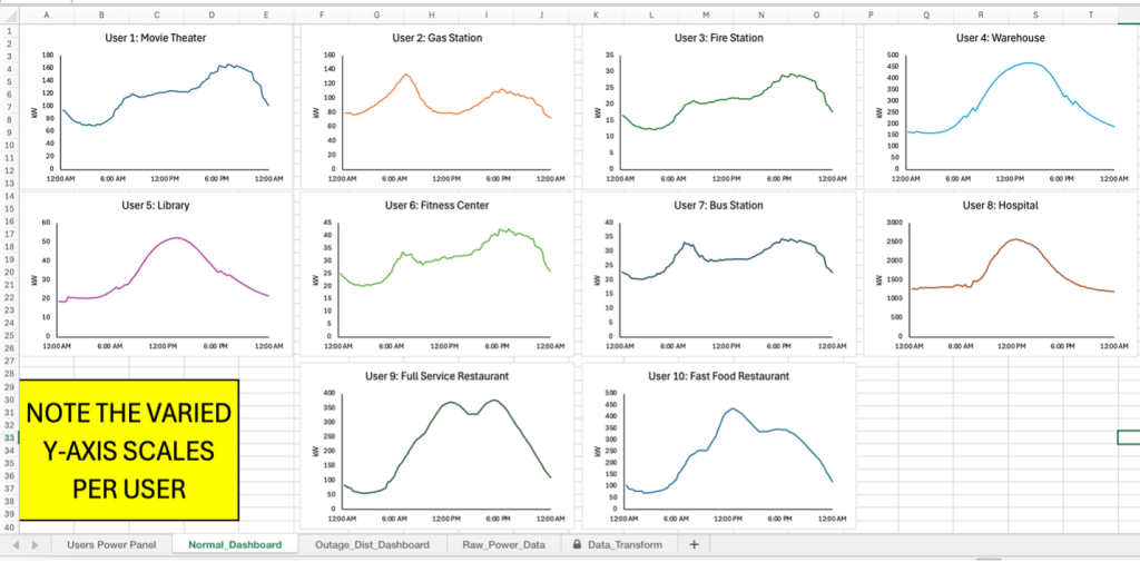
- If you go to the “Normal_Dashboard”, you should see your newly pasted user data graphed visually for the course of an entire day, while the values are adjusted to show the power consumption for the total number of users in that user types, the shapes of the plots should match the daily plots from the previous activity’s notebook. You will NOT be making changes to this sheet.
These plots show normal power consumption for a user if no outage were to occur and will not change when power distribution is altered on the other sheet. An example of what this page should look like can be seen in Figure 3 below. Please note that days are broken up into 4 six-hour increments (12A-6AM, 6AM-12P, 12P-6P, 6P-12A).
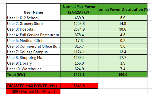
- Now, if you go the first sheet, “Users Power Panel”, this is where you will be making changes to meet the power consumption demands of each user type during the simulated disaster that has caused a partial power outage. Figure 4 below shows an example of the table at the top of this sheet, it will be different depending on your generated data from the previous activity.
This table is populated with data from the raw data you input and shows each of your selected user types along with their normal max power consumed during the day (the specific day that has been chosen for the daily model is March 5, the 64th day of the year).
You can also see the percentage of the normal power that the user demands at their peak, and the total of all peaks (at 100% demand) in the final row of the table.
The red box below this table shows the reduced power generated on the grid due to the simulated disaster, in this case the amount of power you will have available to distribute is 60% of the normal max power available.
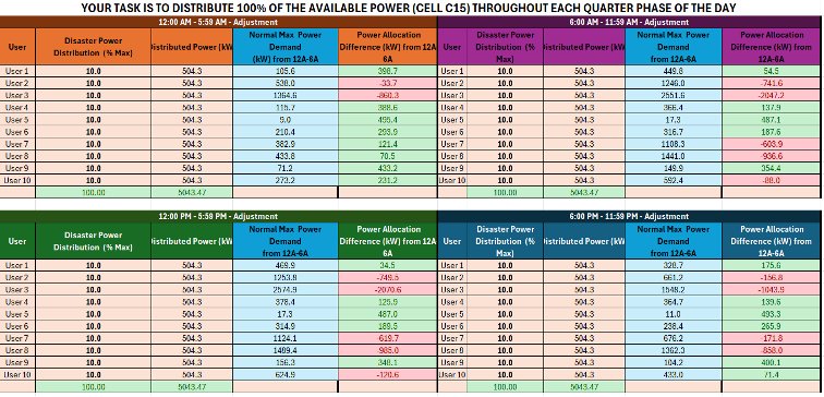
- The panel below this table (shown in Figure 5) is divided into the 4 six-hour intervals, similar to the normal dashboard plots that we discussed above. Each of these tables allow you to adjust the “Disaster Power Distribution” for each user in order to attempt to meet their needs during the power outage. You will need to consider the priority of your users that you created.
IMPORTANT: You will ONLY be changing the second column titled “Disaster Power Distribution (% Max)”, which will determine how much of the limited power that user will be given during that specific time interval. Please take note that the max power for each user changes as the day progresses and some users will need more power in different time intervals.
The current distribution provides 10% of the limited power to each user (totaling 100%) evenly, but you will need to adjust this to meet power demands based on your priority ranking. There are a couple different ways you can see if the power being allocated is enough to meet each user’s needs.
The first is the “Power Allocation Difference” column on the far right of each section of the panel. This will be green if the user is getting more power than they need in the given time interval, and it will be red if the user is not getting enough power. This column is taking the “Distributed Power” and subtracting the “Normal Max Power Demand”.
If all the cells for the “Power Allocation Difference” column are green, no user is suffering a shortage, but if that is not possible with the allowed power from the disaster, some users must be “in the red” based on priority.
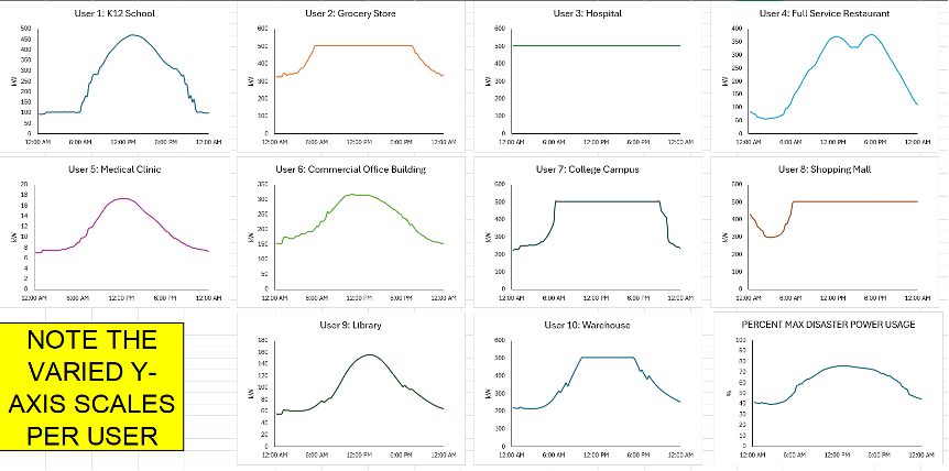
- You can also visualize the adjusted distribution on the “Outage_Dist_Dashboard” sheet in the workbook, an example of this can be seen in Figure 6
This dashboard shows the adjusted power consumption of each user in the simulated disaster outage. In the example shown in Figure 6, you can see that User 1 looks the same as it did on the normal dashboard, since its needs are met. However, for users such as 2 and 3, you can a flat portion of the graph (called a “plateau”) where the user’s demands are not met, and it is consuming the maximum power it is allowed by the smart grid. A closer look at these plateaus can be seen in Figure 7, where you can see user 2 does not meet demands for part of the day, where the hospital does not meet demand for entire daily cycle.
Whenever the cells from the previous sheet are red, there is a corresponding plateau on that user’s graph for that time interval. You can remove these plateaus by distributing more energy to that user (increasing the percent), but that means another user will need to be distributed less power.
The final plot in the bottom right corner shows the percent of the max disaster power being used by the grid, if it is under 100% then proper distribution should allow no users to be impacted by the partial power outage from the disaster.
- Lastly, the “Data_Transform” sheet is generated based on the percentages you distribute to each user on the panel. It is the data that is graphed on the “Outage_Dist_Dashboard”, you should NOT edit this page.
STEP 3 – Redistribute the Power!
Now that you have an overview of each sheet in the workbook and their purpose, you will be completing the following for this activity in order to create the dataset for your AI model needed to train and validate the smart grid:
- Based on your selected users and the priority you have placed them; you will need to adjust the distributed power on the user panel sheet (this is the panel shown in Part C of Step 2 above in Figure 5) as to minimize the impact of the simulated power outage caused by the disaster.
- You will be changing the second column ONLY of this panel in all four segments (each time interval), the number in this column is the percentage of the disaster power that the user is receiving. All of the percentages in this columns MUST add up to 100% or you will not utilizing all the power available (over 100% means you are using more than what is available).
- Please include explanations for each of your distributions for each time interval. If there is a shortage in power explain why a certain user type needs that power more than another in that given interval. How does it impact the user? Use the visualization of the plots to expand on your reasoning. Please fill out the table below.
- When looking at the plots, remember that the “Outage_Dist_Dashboard” sheet shows the impact of the chosen distribution on the user (as shown in Figure 6 and 7 in Part D of Step 2 above). – Recall that the “plateaus” are the flat portions of the curve and represent when the power distributed to the user is NOT meeting the demand, and they are experiencing a loss in power from the outage. Ideally, you want to minimize the number of plateaus or eliminate them, while keeping in mind your selected priority for the users.
- The plots shown on the “Normal_Dashboard” sheet shows the power consumption before the partial outage, as seen in Part A of Step 2 in Figure 3.
|
User |
Percentage of Disaster Power Distributed by Time Interval |
Explanation |
|||
|
12A – 6 A |
6A – 12P |
12P – 6P |
6P – 12A |
||
|
1 |
|
|
|
|
|
|
2 |
|
|
|
|
|
|
3 |
|
|
|
|
|
|
4 |
|
|
|
|
|
|
5 |
|
|
|
|
|
|
6 |
|
|
|
|
|
|
7 |
|
|
|
|
|
|
8 |
|
|
|
|
|
|
9 |
|
|
|
|
|
|
10 |
|
|
|
|
|
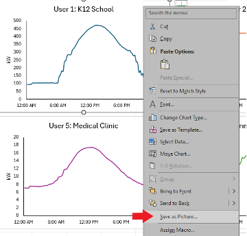
- Lastly, once you decide on your distribution for each user during each time interval (40 total percentages you must change in the user panel – 10 users for each time interval), you can save the individual plots on the dashboards for each user to use in your presentation. You can right-click the graph and click “Save as Picture” in order to save individual graphs to use in your presentation, as seen in Figure 8 below.
- Why do you think it is important for an AI model to be able to handle the power distribution in an actual disaster resulting in partial outage of the electrical grid?
- Please explain your answer in four to five sentences below. Be sure to consider the speed at which a human can reallocate power and the need to make predictions about users’ power consumption when applied to a scenario occurring in real-time. (When making our decisions above we have the advantage of knowing the exact power demands across the day.)
Congratulations! You have created your dataset needed to train the AI model for your smart grid!
After Completion:
- Meet with your team’s mentor to check your work and make changes as needed.
- Save this document as a pdf with the title Activity_4_[Team Name].pdf and have your Quality Engineer submit your PDF here: https://ufl.qualtrics.com/jfe/form/SV_3wwsZbxwqu39mK2

