CLICK HERE TO DOWNLOAD ACTIVITY 3
CLICK HERE TO DOWNLOAD THE JUPYTER PYTHON NOTEBOOK
CLICK HERE TO DOWNLOAD ACTIVITY 3 DATA SET
Purpose
- Teams will select their 10 users for their grid based on the users identified in their area and rank them based on energy restoration priority.
- Teams will consider the power cycle over time. This will allow teams to understand how the different user types utilize power and when the peaks are.
- Teams will be able to use the tools in this activity to generate plots of energy consumption over time for daily and yearly periods, as well as output the simulated power consumption for their area to use in activity 4.
Instructions
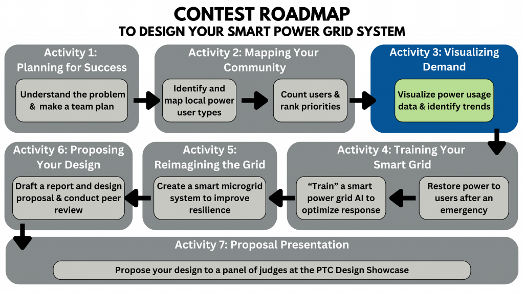
Now that you have mapped out your community and have identified 10 different types of power users, we will now explore their daily and yearly trends in power usage to get a better understanding of how they consume power over time. In our dataset, there are 19 different user types available for you to use. You will select 10 to visualize their daily and yearly power usage inside a Jupyter Notebook. Once you have selected your users, in the order of priority you have created, the plots can be generated and saved for you to download.
Lastly, in order to prepare for activity 4 where you will be “training you model” for distributing power during a partial outage, you will be outputting an excel worksheet with the simulated power consumption for these 10 users over the course of a day.
STEP 1
Let’s start by accessing the Jupyter Notebook on a service called nanoHUB, where you can launch the activity notebook as a “tool”.
- First, you will need to create a free nanoHUB account at the link here: nanoHUB registration
- You only need to fill out the “Required” sections on the registration form and can use your google account to register if you would like.
- If you cannot access nanoHUB please ask your teacher if they can access the website or reach out to your mentor to schedule time to use them as a proxy to run the programs.
- After you have created your account, you can open the Jupyter Notebook tool (as seen in Figure 1 below) by searching for “Jupyter Notebook (202105)”, clicking “Jupyter” on the front page of nanoHUB under “Develop Software” or clicking this link here: Link to Jupyter Notebook Tool on nanoHUB
STEP 2
Now we can use the notebook to prioritize our user’s and output their energy consumption plots.
- Once you click “Launch Tool” on the page (Figure 1), you will see the Jupyter Notebook “Home” page also known as the Jupyter file explorer. You can now upload the notebook (.ipynb) file that you downloaded from Teams, into Jupyter Notebook (as seen in Figure 2 below). First click upload in the top right corner, select the file, then click open, you will lastly be prompted to click upload again on the file at the top of your file explorer (home page). Then, you can open the file.
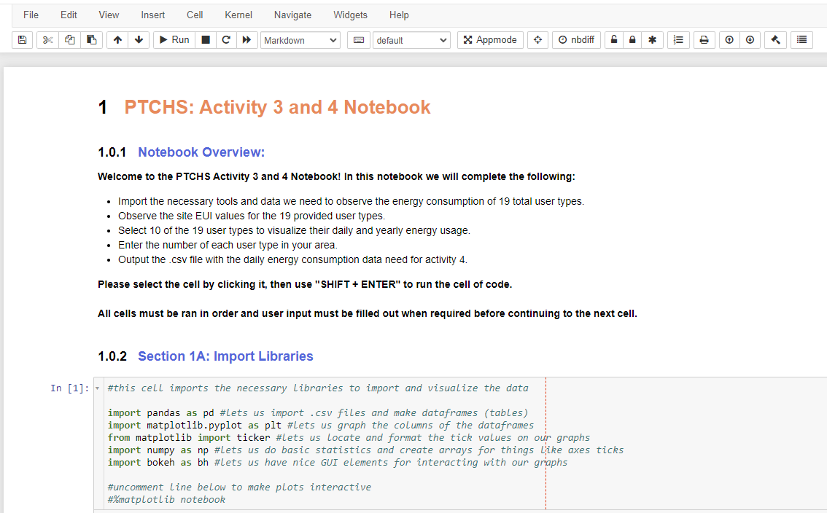
- Once you click to open the file, the notebook should open in another browser tab and look like Figure 3 below:
- When referring to different sections of the notebook, we will be referencing the titles in blue, such as “Section 1A: Importing Libraries”, and not the number in front “1.0.2”.
In order to run the “cells” of code in this notebook, you can click to the left of them and select them individually. When a cell is selected, it will be highlighted in blue, and you can use “SHIFT + ENTER” to run the cell and it will then select the cell under it. Figure 4 shows what it looks like when we select the coding cell in “Section 1A: Importing Libraries”.
- Once the cell is run, it will tell you the duration of its “execution” and what time it was ran below. The “In [1]” on the top left also refers to the order in which the cells were run, with this being the first, and the next cell ran would have “In [2]”, which would also be the case if we ran this cell again. This can be important to note if you make changes in a previous cell or cell’s user input but have not rerun the cells below it to reference those changes. If the cell says “In [*]” instead that means the cell is currently running and could mean it needs user input below it.
Alternatively, you can click “Cell” in the toolbar at the top, and then “Run All” to run all the cells, but you must fill out the “inputs” before it runs the next cell. The options in toolbar “Cell” section are shown in Figure 5 below.
- Please run the cells for “Section 1A” and “Section 1B”, as they are needed to run the code in the cells below. Section 1A provides the tools we use to explore the data through tables and graphs, while Section 1B imports the user type energy consumption data.
If you clicked “Run All”, you will see that all cells have been run until “Section 2” where it will have stopped to receive input.
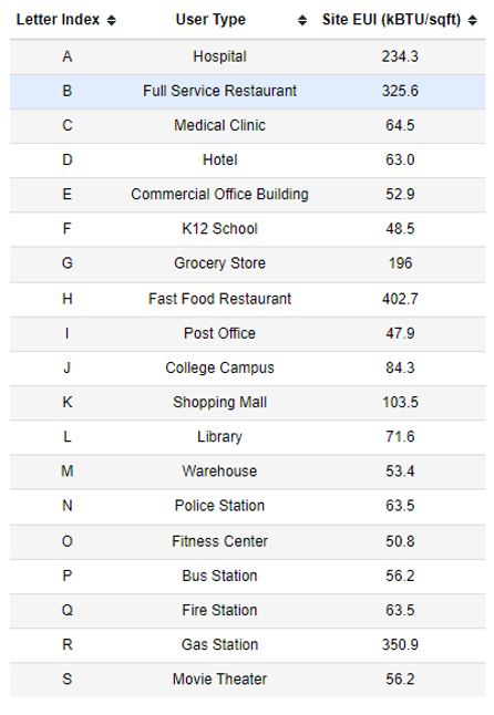
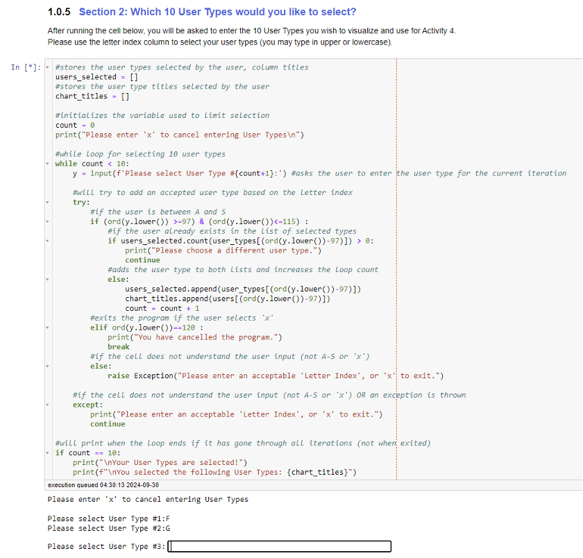
- You will use the “Letter Index” from the table in “Section 1C” (as seen in Figure 6 below) to select your users in order of priority in “Section 2”. For instance, selecting ‘J’ first will make “College Campus” your top priority user and “User 1” in the following graphs and excel sheet.
These users will have their energy consumption plotted below. If you wish to cancel the selection of your user types, you can enter ‘x’ into the text box and restart the selection by re-running the cell. The text prompt and text box for user input in “Section 2” are show in Figure 7 below. Figure 8 shows the location of the user input with reference to the Section 2 coding cell (directly underneath). The input is not case sensitive and will not accept duplicate user types.
- Once you have selected your 10 user types, it will confirm by printing the message “Your User Types are selected!” and then the list of your selected use types in order of priority you determined. You can re-run the cell in order to change this selection if you wish.
STEP 3
- Now that you have selected your user types, you can run the coding cell in “Section 3” in order to print both your daily consumption and yearly consumption plots. These will also be saved in the same folder as the notebook: “png” and “users_yearly_plots.png,” respectively.
- In order to download the files that are output by the code, such as these plots, you will go back to the main browser tab (the Jupyter Notebook file explorer) and check off the file you wish to download (one file at a time), and then click download at the top. This process is shown in Figure 9 below.
You may need to click the area to the left of the plots to “unscroll” them so you can view them without having to scroll in the small output window. You can see the “unscroll” prompt in Figure 10 below.
Observing Daily and Yearly Trends in Energy Consumption
Please paste/insert the plot images, from step 3 above, (both daily and yearly) into this document, in the space below:
Daily
Yearly
Now that you have output the graphs for you users, let’s take some time to consider the different daily and yearly patterns and make any observations that may help us plan our smart grid.
The plots use data measured in energy consumption (in kWh) for every 15-minute interval, meaning that there are 4 data points per hour, and 96 data points per day.
DAILY
- Look at the graphs for DAILY energy consumption. When is the lowest energy consumption for each user in a day? Why do you think this is the case?
|
User |
Lowest Energy Consumption (Time & kWh) |
Why do you think it is lowest then? |
|
1 |
|
|
|
2 |
|
|
|
3 |
|
|
|
4 |
|
|
|
5 |
|
|
|
6 |
|
|
|
7 |
|
|
|
8 |
|
|
|
9 |
|
|
|
10 |
|
|
- When is the highest energy consumption? Do the daily peaks match what you would expect? Why or why not?
|
User |
Highest Energy Consumption (Time & kWh) |
Why do you think it is highest then? |
|
1 |
|
|
|
2 |
|
|
|
3 |
|
|
|
4 |
|
|
|
5 |
|
|
|
6 |
|
|
|
7 |
|
|
|
8 |
|
|
|
9 |
|
|
|
10 |
|
|
- Please describe in a few sentences why your team believes there are fluctuations in daily power for any given user.
ANNUAL
- How does the energy consumption for each user change across the year? What trends are the same between users and what are different? (All of these users are in a “hot-humid” climate, do you think temperature has an effect on these trends?)
|
User |
Trends Jan – Mar |
Trends in Apr – May |
Trends in June – Aug |
Trends in Sept – Dec |
|
1 |
|
|
|
|
|
2 |
|
|
|
|
|
3 |
|
|
|
|
|
4 |
|
|
|
|
|
5 |
|
|
|
|
|
6 |
|
|
|
|
|
7 |
|
|
|
|
|
8 |
|
|
|
|
|
9 |
|
|
|
|
|
10 |
|
|
|
|
Pre-Work for Activity 4
The final part of this notebook is for creating the power consumption data excel worksheet that you will be pulling the raw data from to use in Activity 4 to create a dashboard and “train your model” to redistribute power during an outage. Please follow the instruction below:
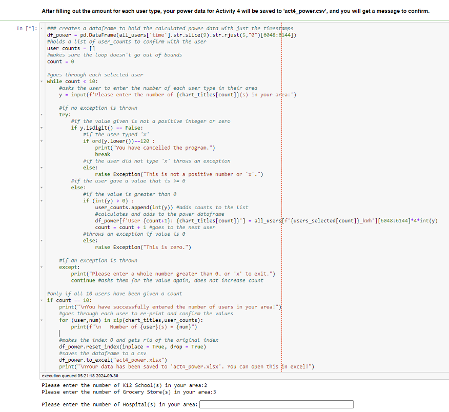
- You can complete this section by running the coding cell in “Section 4”. The user input prompt will generate below the cell, like before, and ask you for the number of each user type in your area based on what you selected above (as seen in Figure 11 below).
If you plan on changing one of the user types to a similar user type based on your previous activities (such as changing “movie theaters” to “water utilities”), make sure to include the number of that user type here and change the name in Activity 4 when creating your dashboard.
The input will only accept positive whole integers or ‘x’ to cancel. It will not accept ‘0’.
- Once you have entered the number of users for each type, you will see the message “You have successfully entered the number of users in your area!” printed out, along with a list of the amount of each user for confirmation. The power data for each user is the energy data multiplied by 4 to get the power in kW, then the number of users to get the total power for that user on the grid.
- Please download the excel file titled “xlsx” that was generated in the same folder as this notebook for use in Activity 4 where you will copy the contents into the provide Activity 4 file to create your dashboard and train your model. You can refer to the same method you used to download the .png files for the plots as seen in Figure 9.
Resources: Power Cycle Overtime
Use and cite outside resources if needed.
U.S. Energy Use Intensity by Property Type – Energy Star
Average energy use per year for different user categories
Energystar.gov – Energy Star
Use the search bar to find reports on energy use throughout the U.S.
Energy Sustainability of Food Stores and Supermarkets – Energies Journal
Journal paper on energy use in grocery stores
Business Energy Advisor – Tennessee Valley Authority
Energy use information for many types of businesses
After Completion:
- Meet with your team’s mentor to check your work and make changes as needed.
- Save this document as a pdf with the title Activity_3_[Team Name].pdf and have your Quality Engineer submit your PDF here: https://ufl.qualtrics.com/jfe/form/SV_3wwsZbxwqu39mK2

